What Color Schemes Work Best for Penthouse Interior Design?
Penthouses are a type of luxury living. living at the top of high-rise buildings, penthouses feature amazing views, open space, and lavish finishes. When designing the interior of a penthouse, choosing the right colour palette is key to creating a beautiful, inviting space. The color schemes you select need to enhance the overall aesthetic and atmosphere of the home.
In this blog that is given by the best interior designers in Dubai, we will explore popular color trends for penthouses and tips for selecting an interior colour scheme that reflects your personal taste and lifestyle needs. Read on to learn which hues lend themselves best to penthouse spaces.
Some Most Popular Color Trends for Penthouse Interior Design
Here are some of the most popular color schemes seen in contemporary penthouse designs:
- Monochromatic: Choose a single color and play with its different shades and tones. This style brings a sleek and calming vibe to your penthouse. Popular choices include cool grays, serene blues, and soft neutrals, unifying the space beautifully.
- Neutral Tones: Embrace creamy whites, warm taupes, and gentle grays for a timeless look. This palette acts as a canvas, allowing you to sprinkle vibrant colors throughout. The result? A penthouse that’s both breezy and chic.
- Bold Accents: Mix neutral backgrounds with eye-catching colors like ruby red, emerald green, or sapphire blue. This approach adds a splash of excitement and personality, turning your space into a captivating haven.
- Natural Elements: Use colors that come from the earth, like moss green, deep brown, and stone gray. This design plan brings the outdoors inside, making the space feel calm and natural.
- Bold Black & White: A black and white style will always look classy and classic. This high-contrast style gives your apartment a modern, classy look that stands out.
How to Select Your Color Scheme
When deciding which color scheme is right for your penthouse, consider the following:
Lighting and Location
The existing lighting and location of the space impact how colors are perceived. North-facing rooms may call for warm tones while south-facing ones can handle cooler hues. Rooms filled with natural light can support vivid shades.
Lifestyle Needs
Your color scheme should support your lifestyle. Busy spaces may benefit from energizing colors. Private relaxation areas may deserve soothing, neutral tones. Decide which rooms require invigoration or calm.
Personal Taste
While trends come and go, your color palette should reflect your preferences. Choose a scheme featuring your favorite hues. Just ensure it complements your home’s architecture and surroundings.
Penthouse Features to Enhance Through Color
Strategic use of color can spotlight or downplay certain penthouse features. Here’s how to use an interior color scheme to your advantage:
Highlight Views
Frame beautiful city skylines or oceanside scenery by painting walls in lighter neutral shades. This keeps the focus on the outdoors. Consider deeper accent walls to anchor spaces.
Define Spaces
Use color to differentiate functional areas within open-concept layouts. A dining space might feature rich emerald walls while living areas showcase airy pastels.
Showcase Architectural Details
For penthouses with ornate moldings, ironwork balconies, or coffered ceilings, avoid busy patterns. Opt for a simple, neutral scheme to let special details shine.
Make Small Spaces Feel Larger
Visually expand tighter areas like bathrooms and bedrooms through light, airy colors like pale blues and peachy neutrals. Reserve bolder colors for larger living zones.
Also visit: https://fixitdesign.ae/
Best Color Scheme Ideas for Key Penthouse Rooms
Here are suggested color schemes for typical spaces:
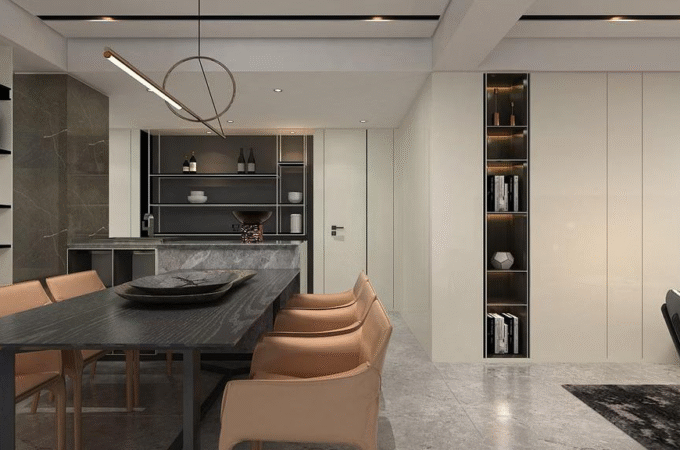
- Living Rooms: Grays or blues with pops of colors like yellow, green, or red.
- Dining Rooms: Deep hues like navy, forest green, burgundy, or chocolate brown. Adds drama.
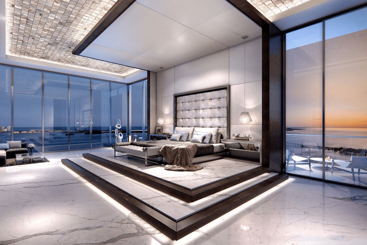
- Bedrooms: Soothing neutrals in cream, light gray, or pale blue paired with one vibrant accent wall. Promotes relaxation.
- Bathrooms: Crisp white with accents of sky blue, silvery sage green, or violet for a spa-like ambiance. Avoid reds.
- Kitchens: Whites and grays for cabinetry combined with quartz, granite, or marble. Add interest through colored glass tile backsplashes.
Conclusion
A thoughtfully composed interior color palette can greatly enhance penthouse living. When selecting schemes, consider lighting, how colors interact, personal preferences, and the atmosphere you wish to achieve. Customize hues to highlight spectacular features and beautiful views. This allows you to fully capitalize on everything a luxury penthouse has to offer. With strategic use of color, you can create interiors that are both aesthetically stunning and highly functional.